Categorization: Sometimes Less is More

Aug 16, 2011
Guest post by Jessica Heinzelman. Jessica is an active member of the Ushahidi community and an independent program design and strategy consultant. Her experience includes the Ushahidi-Haiti Project; Ushahidi's Uchaguzi platform; the Standby Task Force Verification Team and Sisi Ni Amani, a Kenyan NGO that empowers community peacebuilders with an SMS-based system for localized conflict prevention, early warning and response.
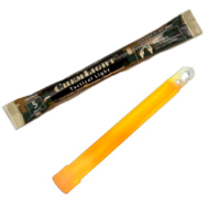
Ushahidi allows users to create and visualize categories to help organize and analyze data. But sometimes category lists get out of control, slowing report processing and compromising accuracy, or at least consistency. What I learned about the way the U.S. Armed Forces use categorization and maps at the Esri User Conference in San Diego provided an interesting lesson – when it comes to categorization, sometimes less is more. For decades U.S. Military units patrolling in conflict areas have dropped chem lights (glow sticks) that provide information to the next unit that passes – green (everything is fine, proceed as normal), yellow (something is fishy, heighten your senses), and red (warning, high alert!) They are simple, universal codes that are quickly and easily understood. The chem light of today is virtual. Military units carry mobile devices and use a touch screen to “drop” a red, yellow, green and now blue, marker onto a map, which immediately appears on screens at the command center as well as the mobile device of every unit in the area (reminiscent of Ushahidi in many ways). As a result, military analysts have a more complete picture of what is happening in the field.

My immediate thought: Think of all the additional data they can collect! The categorical red, yellow, green could be supplemented with qualitative insights. A yellow virtual chem light could include notation – there is an unusual gathering of young men outside a coffee shop or unidentifiable materials are being loaded into a car near the market. An analyst’s dream…right? WRONG. The U.S Military rejected the technology that would allow for more qualitative data collection and sharing through mobile units. From a field perspective, it would distract. A soldier typing and reading notes in a device, is a soldier that is not engaged with his surroundings, as he needs to be for his job and his safety. From an analysis perspective, a few reliable inputs are digestible. To many variables increase the potential for miscommunication and add to confusion. If analysts identify trends or points of concern in the big picture, they can drill down further with radio communication. While the technology is available to make highly detailed information collection possible, the Military’s cost-benefit analysis of qualitative notation on virtual chem lights came back in favor of simplicity.
So what does this mean for Ushahidi users?
Before launching an Ushahidi instance, users benefit from conducting our own cost-benefit analyses. In most cases, the cost of adding a category is much greater than the 5 minutes it takes the administrator to choose a label and a color.

Before adding a category ask:
Is this category useful, not just interesting? How will the level of detail in your categories impact your analysis and action? Don’t waste time and admin resources on information that doesn’t help achieve your goal. Example: While it may be interesting to know how many refugees need water and how many need food, if any humanitarian delivery will include both, would a category “Basic needs” suffice?
How much time will this category add to processing a report? Humans can only hold so many categories in their head at once. Category lists of more than 6-10 often require people to read through the options each time they categorize a report. A quick read-through the list may not seem like much additional time for one report, but an incremental increase can be significant multiplied by hundreds or thousands of reports.
Is this category distinctly unique or open for interpretation? Red, yellow, green are clear, universal symbols understood around the world. The more complex the categorization, the more room there is for errors in interpretation. Reduce confusion by avoiding categories that require nuanced judgment or contain overlap. Afterall, what good is highly segmented and detailed data if you can’t trust that it is uniform? You can always dig into the individual reports if further information is needed. An upcoming keyword visualization tool, on which Ushahidi and Esri are partnering, will also be able to help identify trends without clogging the categorization system.
Where does this category fall in your priorities? What will help you achieve your goal – detail, speed, accuracy? If detailed categorization will help, but accuracy and speed of processing is more critical to your success, find the balance that makes sense for your particular use.
Just as the U.S. Military has strategically chosen to keep virtual chem lights simple, Ushahidi users will be most effective if they weigh the costs and benefits before adding a category.
About ESRI and potential for Ushahidi users
Esri makes the most widely used Geographic Information System (GIS) software. GIS software allows users to create, store, manipulate, analyze, manage and present all types of geographic data.” GIS software has been used by many Ushahidi users who want to dive deeper into the understanding what the crowdsourced information is telling us, or use the Ushahidi data with other sources of data such as economic indicators, calculate distances or visualize geographic trends overtime. The potential of Ushahidi + GIS was discussed on the Ushahidi Blog’s bookmarklets post. You can also get a flavor of what Esri has been working on for and with the Ushahidi and crisis response communities in Australia (Ushahidi ArcGIS Desktop integration prototype) and Japan (Tsunami Trends Map). This kind of advanced analysis capability will make thoughtful categorization even more important!